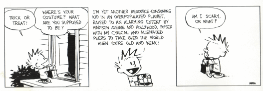
Calvin and Hobbs can generally be understood by children to the sense of, "Hey the boy wants candy, says something long and confusing and gets candy at the end. That's funny!" Yet to a adult, the comic is possibly funny at first, as well as quite scary at the same time. Obviously, the boy is proving his point as a regular boy, while also a threat to the environment.
While there is only one main character shown completely in this strip, the two with lines are both equal in importance. Calvin's part could essentially be any common boy in the world. The fact that he has spiked hair or a striped shirt is essentially insignificant. If the boy was concealed in a shadow, it wouldn't make any difference other than his part in being completely open about his part in the world. The home owner's part is the same way. He or she is concealed behind a thought bubble, but this doesn't affect the character whatsoever. It's possible the character is concealed due to the lack of importance to the situation or the lack of care that the older generation has to do anything. I am a bit confused of why the artist would choose to draw Calvin with his last, "Am I scary or what?" line as he is walking away from the house eating his candy. Obviously this is the punch line and also the main point to the cartoon, but why would it be after Calvin has already left the house? I would think this line would be better added immediately after Calvin's line about being a "resource-consuming kid."
The typography of this comic is generally quite simple to decipher. The cartoonist picked a text font that matches the ideas behind the comic quite well. While a certain font can't "be" more or less childish, this particular one seems to be more childish, probably because of its similarity to a younger kid's writing. Also, the usage of white space around the type between the font and the illustration allows for an easier read. The pictures themselves are also not very complicated and allow the reader to get the gist of the idea without overdoing the panels. While a speech bubble is used in panel one, it is not in panel two probably because of the simpler illustration. So to explain why the third panel, the simplest illustration in the strip, look no further than the earlier mentioned point about the punch line. Since the illustration really isn't of much importance, the thought bubble around the few simple words causes a point of focus. By doing this, the cartoonist forces the reader to understand the cartoon's main idea rather than focusing too much on the unimportant drawing.
No comments:
Post a Comment