Tuesday, December 8, 2009

Writing Project 3

The year is 1967. NASA's Apollo 1 catches fire on the launch pad killing three astronauts. Martin Luther King Jr. publicly denounces the Vietnam War. Race riots become almost common across the United States. Segregationist Lester Maddox becomes the Governor of Georgia, and a little know sculpture, "SANDY: in Defined Space" is molded and placed in the University of Nebraska's sculpture garden.

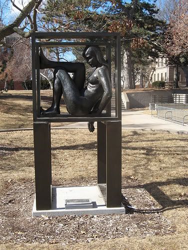
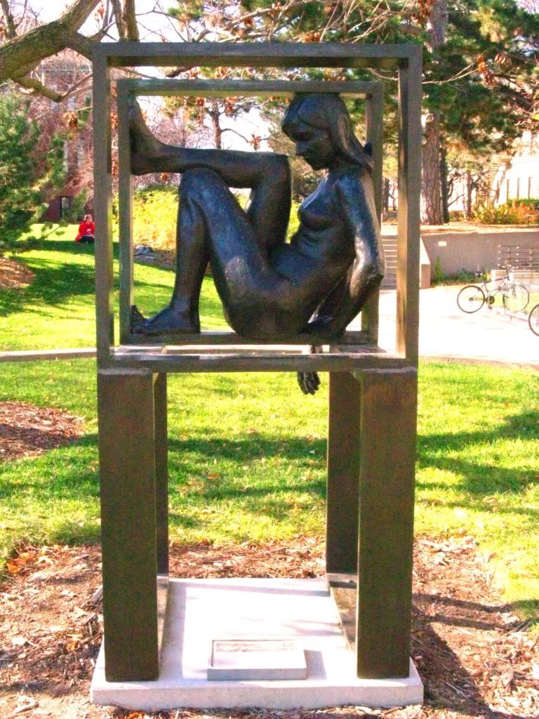
1967 was a tumultuous time in our nation's history. Many people were simultaneously trying to carve out their own rights while avidly going against what the government was doing such as the Vietnam War. A man named Robert McDermott Miller created a sculpture that seems to be very characteristic of the time period and can be seen as somewhat of a protest piece if it is taken the way that seems to make the most sense. In the simplest form, SANDY is a woman sitting nude amongst several square geometric shapes, several feet above the ground. Her body is rough and unpolished whereas, in contrast, the shapes surrounding her are highly refined and have a bit of a shine to them.

Beyond the first obvious appearance of the sculpture, there also lies an enormous amount of symbolism and idealism that ties directly in with the theme of being a symbol of the desegregation of gender movement of the 1960s. When you take a look at the sculpture in terms of piecing different parts with a portion of the movement, it is quite obvious what is what. By taking SANDY as a representation of all women and the geometric figures as a form of societal foundation on which gender roles are built or held, it is possible to see that SANDY is less "Defined," but more "confined."

When looking at SANDY, her skin is noticeably rough and unfinished, much like the way that women at that time may have felt. Women had made great progress to get complete fairness and rights, but in the grand scheme, still lacked much of that that men were able to benefit from. Also, the geometric shapes are finished and smooth with sharp edges and defined corners. This is a representation of the framework that has been built, fortified and held over women for centuries. It is what has kept women in an exact role without giving them much of the freedom that men have.

Another clear way to see the distinction of this theme is to break down the sculpture into pieces. Notice there are pairs of nearly everything in this sculpture. The base of the woman’s position is made of two geometric, open squares places symmetrically side by side. Above them are two more shapes placed perpendicularly, but still symmetrical and the same. Yet arguably the most important key piece of the entire sculpture, SANDY, is all by herself leaving the piece somewhat off-balanced and also providing a bit of uniqueness that creates the main meaning behind the artist’s intentions. Should SANDY be missing from this sculpture, the piece would be nothing more than a framework with no over-the-top meaning.

Given of course that SANDY is present, it would be key to analyze, what is missing? The pair to a woman of course would be a man. Taken that the shapes surrounding SANDY represent the framework of a female oppressive society, the absence of a man obviously shows that men don’t abide by the same code and rules that keep women held to a certain set of guidelines.

Another piece of interest is the positioning of objects within the sculpture. SANDY is seen sitting pushed up against every edge of the square. This could be taken as a woman pushing against the confines that hold her. Also notice that her right arm is fallen limply outside the box showing that she may be working toward breaking out of the structure keeping her enclosed. On the other hand, a man may not necessarily be “missing” from the sculpture, but Miller may have just intended the idea of the sculpture to be taken very liberally. Should a man walk up to the edge of the side opposing SANDY and peer inside, he would become part of the piece. As a man, he would not be held to the same confines as SANDY and thus by looking in from the outside proves the point that the same framework that holds women does anything but for men. Taken to even more of an extreme, if a man used the structure to brace himself while looking inside, he also could be taken as aiding the framework to hold the woman and could be seen as anything but empowering.

All this said, it is easy to see that with all these examples and pieces of symbolism, there is no doubt that Miller intended this piece as a criticism of feminist oppression. The 60s was a time for self exploration and a new desire to expand horizons and create new ideas. Sculptures such as “SANDY: in Defined Space” pushed the limits between appreciated and acceptable. Using these less than conservative ideas, we can easily see that Miller intended this piece for much more than a naked woman on a college campus.

Friday, December 4, 2009

Statement of Purpose

"SANDY: in Defined Space" stands as an interesting symbol nestled in the pasture behind Sheldon Art Gallery. Nearly anyone that passes surely notices the strangeness that the sculpture presents, and that in itself is one of the foremost points of this artwork. The audience that has the opportunity to view SANDY varies as greatly as the general population. Fact is, by being witnessed by so many different types of people, the sculpture takes on an equally varied perspective of purpose, theme and inspiration. To completely understand, it make sense to first go into the details that comprise this piece.

For instance, the shapes and styles of the different parts of the sculpture are very important. When viewing the sculpture in the picture at left, it is clear to see the distinct difference between the rounded, seemingly organic, shapes of SANDY's body and the flat, clean, rigid framework that surrounds her. This is one point that can be viewed in a few different ways. As this sculpture was designed and constructed in 1967, there is an easy to see connection between SANDY's position in a framework box and the civil rights battle that was raging throughout society at the time. Given SANDY's posture of being pushed against each of the four corners and sides of her square, it can be viewed that she is still being cofined to her sector of society, but that she is starting to reach out and get a feel for what life is like on the outside. Truly, this would be a woman's seen purpose of the piece.

As for a what a man may see, realize how the sculpture is constructed with two squares supporting two squares with pairs of angles everywhere, yet SANDY is alone on her side of the sculpture. With a bit of inferring, the pair to a woman is a man, which seems to be missing. Now again to the civil rights purpose, where a man obviously wouldn't be stuck on the inside of a framework box. Yet, if a man stepped up and looked into the box, the sculpture would be complete with a man looking from the outside in on the woman looking for the inside out.

"SANDY: in Defined Space" is a very deep sculpture, much deeper than a first glance may provide. A woman sitting in a mostly open box is transformed into a inspirational lecture about civil rights and gender theory. Of course Robert Miller had better intentions for his most famous design than for wondering students to look at a naked bronze girl sitting uncomfortably three feet above the ground. Possibly these intentions didn't involve civil rights at all, but had they been? Well he would have hit the nail on the head.

Monday, November 30, 2009

WP3: Prewrite 3

If there is one genuine moral that can be gained from Wayne Coyne's "Zaireeka," it's that there is much more to be gained from a normal occurrence or piece of art than what is commonly noticed. For instance, the entire album is meant to be listened on four separate musical amplifiers playing simultaneously so that each of the four parts jive together into one complete piece. Obviously this isn't how music is normally heard and Coyne had to think well outside the box to even come up with this idea, let alone put it into action.

Likewise, with my upcoming sculpture rhetorical analysis (so no, I will not be partaking in any imitations or sculpture hugging), I will have to think in a different light than I normally would to be able to understand the ideas being brought out by my sculpture and the reasons why my sculpture is significant enough to be deemed worthy of having real estate on the campus of a major university. With that as an idea, I have a few insights.

My main idea is most definitely the sculpture's relationship with the area surrounding it. When viewed from a side taking into account the nature and nearby architecture, "SANDY: in Defined Space" takes on a very strong role as a focus. While I never would have thought that a piece of artwork could really fit into a landscape without being camoflauged or hidden, SANDY gave me a new realization due to its use of perspective and location. Using the picture at right of SANDY in a very non-primary view, it's easy to see how easily the bronze sculpture fits into the surrounding area. The grass is obviously cut around the base, but the tree follows up the right side of the sculpture and the main branch bends leftward as if following the contour of SANDY's shoulder and head. The roof of Westbrook cuts down and to the right as if completeing the top of the box that is not present. Even the sidewalk behind SANDY is drawn near parallel to the level of bronze that the woman is sitting on. Now, while all this may not tell us an exorbanat amount of information about the piece, we can arrive at the conclusion that SANDY was most likely not a random selection nor was the location in which she sits picked on accident.

Of course, by looking at this piece, many questions are drawn out. I myself was left asking, why is the woman sitting there and not on the flat ground? Whay are there only two levels of squares? Why is the woman unclothed in exhibitionist form, yet the name itself says SANDY is in a defined space? Truly there are many things that the sculpture draws us to think, but at the same time, it is just as easy to take what is noticable from it. To take this sculpture apart, item by item is the goal of Zaireeka, yet the case may call for something more along the lines of a general concept such as the one that I have uncovered here.

Tuesday, November 24, 2009

WP3: Prewrite 2

The "quality" of art is a matter of judgment and there is no obvious set way for anyone to create a pre-determined scale in which to grade pieces of artwork. That said, there is also no real clear guideline between what is art and what is not, simply a distinction between types such as sculpture or painting, etc. For instance, a piece of artwork inside of an art museum can be just as spectacular as one outside, or even the building itself which can be construed as art. Likewise when taking a piece such as the one at left of "SANDY: In Defined Space," it's difficult to determine where the art stops and where it begins, but only where the sculpture begins and ends.

A piece of artwork in an outdoor setting somehow gives us a different outlook on how we should view the art. Wheras it sounds "sophisticated" to take a stroll through an art gallery, taking a peaceful walk through a sculpture garden doesn't sound quite as elegant. But why? The art outdoors is often times just as magnificent as that of its indoor counterpart, yet it lacks the same respect. Possibly we just have an altered idea of what really constitutes art as a whole and don't realize that nearly everything is artful.

Taking a look back at the picture, we can obviously see the main, general sculpture in the middle of the scene. The stacked boxes with the nude grl inside cast in bronze on a concrete base would generally be constituted as art. Now thinking further, what helps this sculpture stick out even more than the lighting and landscape surrounding "SANDY?" Should that not also be considered as art? In all actuality, the landscapers may have taken just as much initial effort and insight to create the surrounding feaux-nature, but do not gather near the credibility. Just the same, "SANDY" was set in 1962 and has hardly been upkept by more than a cleaning ever since. On the other hand, the landscaping has to be upkept nearly every day and has lasted since the early 1900s when this section of the campus was first developed. If anything, the landscape should be considered possibly more artsy than the sculpture.

Now relating this to John Cage's 4'33", and Friday's class meeting, we can see that our observance of what is a class and what isn't a class is altered by a predetermined jugement of what a class has ever been since we began schooling nearly a decade and a half ago. Similarly, we also seem to think that the level of how much we learn during a givin class period is determined by how much the instructor lectures, how many notes we take and how much time we will have to put aside for studying between now and next week's test. Maybe if humans were able to grasp the larger picture and not go simply on developed instinct, we would be better apt to learning and generally more open minded. By creating an environment lacking a traditional instructor, such as that on Friday, we decided to wonder and basically waste our time instead of taking advantage of the situation to discuss something useful and understand better what was happening.

Thursday, November 19, 2009

WP3: Prewrite

Truthfully, I was dismayed at first to be stuck with Richard Miller's "SANDY: in Defined Space," but after staring at it for the better part of an hour and a half, most anyone can develop some interest in a piece. In short, the sculpture is of a, most likely, younger twenties woman sitting naked inside one of several square shapes balancing on each other so that they in turn form a square shape when viewed from above. Though the bronze sculpture is not entirely intricate, nor does it seem to have been very difficult to construct for a skilled caster, but it does seem to have somewhat deeper meaning than simply an unclothed woman sitting in a box.

One thing that quickly jumped out to me is the emotion displayed by this sculpture. As we can presume, Sandy is sitting in a crunched up, seemingly uncomfortable position with her head bent over. While the vector of attention from her eyes doesn't lead to anything significant, it does set the mood of the piece. I became sorry for Sandy and even thought the piece would be more aptly named "SANDY: in Confined Space."

There are also a few points that make this piece very difficult to grasp completely. For one, whether Sandy is confined or defined, either of which only make sense to an extent. She does seem well within the boundaries of the box, but notice the one hand that is let loose. Again, from the side, her body sticks out well to each side giving her a certain bit of freedom. Beyond her physical location, but speaking of freedom, she is nude on top of it all. Nakedness is one of the most classic forms of freedom and self exploration possible, yet Sandy is still in a "defined" space. Lastly, through a little bit of research, I found that five castings of this sculpture were made in the 1960s. The two most notable are on the UNL campus and the other resides at the University of Houston. Now if Sandy is confined to only one place, how did she get halfway across the country?

Sandy is an interesting piece, but hardly seems representational of her namesake. through vectors of attention, symbolism and the simple name analysis, we can find that Sandy's being is a bit off. Possibly Robbert Miller had a very narrow mindset for how the sculpture was to be perceived and didn't think of all the ways that it would not make sense, or maybe that's half the reason for the name is to make people wonder why it would take on a name that is so unfitting. Certainly, there is more to be figured out as I delve deeper into the ideas and purpose of "SANDY: in Defined Space."

Wednesday, November 18, 2009

Blog Post 11: Art Experience

So far, I have had very limited experience with most types of art. My first true art class was not until just this past year. It was not very in depth, lacked term knowledge and was compiled of a series of projects. Sure I learned about clay and drawing from perspective, but I did not learn very much about the art itself. Likewise, I also have not had much practice analyzing artwork, though I do find analyzing songs and other written works quite interesting.

In this project, analyzing a sculpture will be somewhat difficult unless I can tailor the project back toward my interests of symbolism and comparison to other works. Fortunately, I'm fairly decent at somehow finding connections with what I'm looking at to other pieces, objects or events.

All this is not to say I don't have interest in art, because surely I do, but it has never been high on the list of priorities in my life. I enjoy a trip to the art gallery once in awhile as it does interest me, but again, I'm not one for creating it myself. If we wanted to take this extremely liberally, I also like creative writing and most all types of music. Generally, I don't consider these art, but in a sense, they certainly fulfill the idea.

Tuesday, November 17, 2009

WP2 Final Draft

Author's Note

Truthfully, when I read the assignment details for writing project 2, I was less than excited. It just seemed like an overgrown version of the first writing project, but instead of using one photograph, we would be using three or four hand-drawn pictures. Little did I realize that I could skew this assignment back toward a way that benefited me both intellectually and personal interests. I knew right away that I did not want to use a comic I was unfamiliar with. I wanted it to be something I at least had some background information on. So as I looked, I stumbled on this Calvin and Hobbs cartoon. Though I did not by any means grow up on Calvin and Hobbs, I certainly knew a bit about the idea. A boy and his tiger and they go on adventures, how much harder could it be?

As with the first writing assignment, my dislike for editing hit again. I did change significantly more in this assignment than the first however. For instance, from the first draft to the second, I included nearly an entire introduction. The first version had just a sentence lead into the comic, but no introduction. In the second draft, I included a cohesive introduction that flows into the body much like the first, but with more background and introduction than the first draft allowed for. Also, I added a few terms from "Compose, Design and Advocate" that were necessary to tie the piece together.

This project tought me how to work with things that I don't like at first in order to put a spin on them that will create a better suited idea for me. When I am able to turn a project in my favor, it better enables me to write a paper that is acceptable and create a writing environment better suited to my skills. When in a predicament that leads to unsuccessful writing products, I am shown that I did not put in enough effort to taylor the assignment to fit my needs. I also need to learn that my writing isn't perfect and not to be so picky over edits. I'm sure that will also come in time.

Links

Rough Draft 2
Rough Draft 1
Statement of Purpose

Writing Project 2

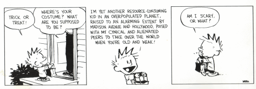
The medium of comic writing is a well underrated method of getting a substantial idea across to a mass audience while also keeping them entertained. A coming writer can have an entirely different message than what comes out the first time a paneled strip is read. A simple trick or treat encounter can turn into a massive plea to the American public to wake up and understand that something is wrong with how we do things. In a day where few children dress up as a classic vampire, Frankenstein or other normally scary figure in exchange for their favorite character from a television show, Bill Watterson, creator of "Calvin and Hobbs" takes it one step further:

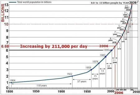
In this cartoon, Watterson uses Calvin's innocence as a young child as his scary costume. By juxtaposing the innocent young boy against the contextual reality of his actual standing in the world, it is obvious to see Calvin's costume is much scarier than what the reader would originally think, which is also why this cartoon is able to make a point. If instead of the cynical cartoon, the reader instead simply saw a model of population trend like the one below, the point would not be the same.


Sure this graph proves the same point of where global population is heading and that any one child is "just another resource-consuming kid in an overpopulated planet." At the same time, the graph fails to have the medium of voice that a cartoon has that can "speak" to the reader and help them understand through means of persuasion rather than simply presented facts. This is the same reason that activist's like Al Gore chose the medium of film production to get points across instead of only writing a book or publishing graphs and statistics in a newspaper. By being able to voice an opinion, either through creative writing or voice itself, a person has a much better chance of getting general people to understand the idea they are setting forth.

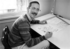
All this brings us back to Bill Watterson and why he would create this cartoon in the first place, of which there are many reasons. First off, Watterson was born in Washington D.C., but moved to Chagrin Falls, Ohio at an early age where his mother became a town council representative leaving Watterson with a childhood full of political upbringing. Watterson then moved on to college where he defied his parents wishes for him to go into writing, and instead graduated with a degree in political science. So although this comic could have easily been created by anyone adapt to watching the news and realizing overpopulation is an issue, a person like Watterson with deep political influence is only creating on the topic he knows best.

Calvin and Hobbs was written over a 10 year period mostly during the 1980s. Watterson's cartoons often conveyed a deep meaning but at the same time were generally funny for children to read as well, although they most likely did not understand the true points of the writing. When Calvin and Hobbs first came out an eight or nine year old would see a tiger and a boy and they would say something that seemed funny, so they would keep reading the strip. Now think as that child matured into a teen and possibly even a college student, the meanings would go from the simple surface judgments to fully developed in depth thinking. The young adult would start to ask questions and be truly persuaded by the writing. Much of this is due in part to the medium used of cartoon writing. As Americans generally go, Sunday Morning Cartoons are as part of our culture as 60s muscle cars and chasing the ice cream truck down the street. That means people respect cartoon writing as more than just a piece of entertainment, but a near priority. If someone puts something like comic reading so high, they must also have the sense to respect what it is saying, and after a time, the points will actually start being driven into their mindset. This is why Watterson stuck with cartoon writing as his means for persuading his points.

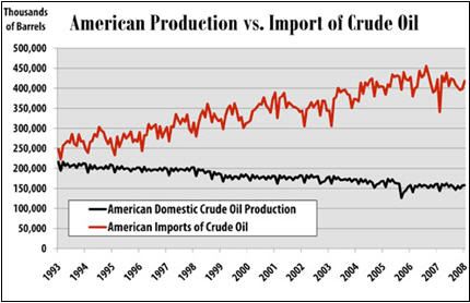
Going back to the cartoon, conventions are a main aspect of why it comes together so well, mostly because the cartoon doesn't stray far from normal cartoon format. There are some key points, for instance, the second panel is obviously where all the action of the cartoon happens, and that should be able to be seen without even reading the text. Watterson uses techniques such as zooming in on Calvin in particular, leaving out a frame and thought bubble in the second panel and also just the simple large amount of text that show this spot as the most obvious source of action in the cartoon. The second panel also yields a bit of political symbolism involving Calvin's trick or treating bag. Substitute Calvin for any general American. Now realize that he is telling this generous person that his costume is simply that of a "resource consuming kid," yet still holding out his bag for more. Surely, anyone could make the connection between Calvin in this strip and the United States as a whole. We know we consume, pollute and dispose of the most, yet we always seem to be reaching out and grabbing for more. Just look at the way we rely on other countries for our oil instead of producing our own. Likewise, the conventional change of covering the face of the person handing out the candy shows that the person giving out the candy or "exporting " to the United States, can be anybody, but by covering the face, Watterson does not have to make an absolute ethnicity choice of the person, or even the gender. By making these only somewhat hazy connection, Watterson again puts his point across without stepping over the lines of the cartoon becoming an all out editorial persuasive political cartoon.

Even with all that in the second panel, the third is nearly as interesting. Though the simple, small amount of words and the very minute amount of drawing may detour most from capturing the full extent of the frame, it certainly has a lot to say. Again with the symbolism, after Calvin gets his "resources," before even getting away from the house, begins consuming what he has been given. Doesn't that sound strangely reminiscent of most industry in America? How about the entire idea of fast food? People go to a fast food drive through and begin eating during the ensuing drive to wherever they are going without even thinking about what they are doing. How many times have we seen or can we remember getting a toy when we were young and needing to play with it as soon as possible before even getting back home? Often times, we were bored with the toy after a week anyway and it went unused. Similarly, Calvin appears to have munched all his candy away as quickly as it was given to him.

Calvin's adventure on Halloween is much more than a mildly humorous attempt at generating a costume out of being too lazy to make one. It truly gives a deeper symbolic look into how Americans generally feel and react to what they receive. Watterson's cynically political outlook on a simple childhood tradition is both comical, but a horrible realization at the same time. True, Calvin's intelligence did get him the candy he wanted, but it also perpetuated the poor cycle of immediate gratification. Using a cartoon as such a medium to get this point across was an excellent idea and Watterson should be commended for such a strong ideas and means of getting his ideas out to a general audience.

Works Cited

"Comic Creater: Bill Watterson". Lambiek. 11-6-09 .
"GoComics". UCLICK. 11-5-09 .
Tuesday, November 10, 2009

WP2 Rough Draft 2

The medium of comic writing is a well underrated method of getting a substantial idea across to a mass audience while also keeping them entertained. A coming writer can have an entirely different message than what comes out the first time a paneled strip is read. A simple trick or treat encounter can turn into a massive plea to the American public to wake up and understand that something is wrong with how we do things. In a day where few children dress up as a classic vampire, Frankenstein or other normally scary figure in exchange for their favorite character from a television show, Bill Watterson, creator of "Calvin and Hobbs" takes it one step further:

In this cartoon, Watterson uses Calvin's innocence as a young child as his scary costume. By juxtaposing the innocent young boy against the reality of his actual standing in the world, it is obvious to see Calvin's costume is much scarier than what the reader would originally think, which is also why this cartoon is able to make a point. If instead of the cynical cartoon, the reader instead simply saw a model of population trend like the one below, the point would not be the same.


Sure this graph proves the same point of where global population is heading and that any one child is "just another resource-consuming kid in an overpopulated planet." At the same time, the graph fails to have the medium of voice that a cartoon has that can "speak" to the reader and help them understand through means of persuasion rather than simply presented facts. This is the same reason that activist's like Al Gore chose the medium of film production to get points across instead of only writing a book or publishing graphs and statistics in a newspaper. By being able to voice an opinion, either through creative writing or voice itself, a person has a much better chance of getting general people to understand the idea they are setting forth.

All this brings us back to Bill Watterson and why he would create this cartoon in the first place, of which there are many reasons. First off, Watterson was born in Washington D.C., but moved to Chagrin Falls, Ohio at an early age where his mother became a town council representative leaving Watterson with a childhood full of political upbringing. Watterson then moved on to college where he defied his parents wishes for him to go into writing, and instead graduated with a degree in political science. So although this comic could have easily been created by anyone adapt to watching the news and realizing overpopulation is an issue, a person like Watterson with deep political influence is only creating on the topic he knows best.

Calvin and Hobbs was written over a 10 year period mostly during the 1980s. Watterson's cartoons often conveyed a deep meaning but at the same time were generally funny for children to read as well, although they most likely did not understand the true points of the writing. When Calvin and Hobbs first came out an eight or nine year old would see a tiger and a boy and they would say something that seemed funny, so they would keep reading the strip. Now think as that child matured into a teen and possibly even a college student, the meanings would go from the simple surface judgments to fully developed in depth thinking. The young adult would start to ask questions and be truly persuaded by the writing. Much of this is due in part to the medium used of cartoon writing. As Americans generally go, Sunday Morning Cartoons are as part of our culture as 60s muscle cars and chasing the ice cream truck down the street. That means people respect cartoon writing as more than just a piece of entertainment, but a near priority. If someone puts something like comic reading so high, they must also have the sense to respect what it is saying, and after a time, the points will actually start being driven into their mindset. This is why Watterson stuck with cartoon writing as his means for persuading his points.

Going back to the cartoon, conventions are a main aspect of why it comes together so well, mostly because the cartoon doesn't stray far from normal cartoon format. There are some key points, for instance, the second panel is obviously where all the action of the cartoon happens, and that should be able to be seen without even reading the text. Watterson uses techniques such as zooming in on Calvin in particular, leaving out a frame and thought bubble in the second panel and also just the simple large amount of text that show this spot as the most obvious source of action in the cartoon. The second panel also yields a bit of political symbolism involving Calvin's trick or treating bag. Substitute Calvin for any general American. Now realize that he is telling this generous person that his costume is simply that of a "resource consuming kid," yet still holding out his bag for more. Surely, anyone could make the connection between Calvin in this strip and the United States as a whole. We know we consume, pollute and dispose of the most, yet we always seem to be reaching out and grabbing for more. Just look at the way we rely on other countries for our oil instead of producing our own. Likewise, the conventional change of covering the face of the person handing out the candy shows that the person giving out the candy or "exporting " to the United States, can be anybody, but by covering the face, Watterson does not have to make an absolute ethnicity choice of the person, or even the gender. By making these only somewhat hazy connection, Watterson again puts his point across without stepping over the lines of the cartoon becoming an all out editorial persuasive political cartoon.

Even with all that in the second panel, the third is nearly as interesting. Though the simple, small amount of words and the very minute amount of drawing may detour most from capturing the full extent of the frame, it certainly has a lot to say. Again with the symbolism, after Calvin gets his "resources," before even getting away from the house, begins consuming what he has been given. Doesn't that sound strangely reminiscent of most industry in America? How about the entire idea of fast food? People go to a fast food drive through and begin eating during the ensuing drive to wherever they are going without even thinking about what they are doing. How many times have we seen or can we remember getting a toy when we were young and needing to play with it as soon as possible before even getting back home? Often times, we were bored with the toy after a week anyway and it went unused. Similarly, Calvin appears to have munched all his candy away as quickly as it was given to him.

Calvin's adventure on Halloween is much more than a mildly humorous attempt at generating a costume out of being too lazy to make one. It truly gives a deeper symbolic look into how Americans generally feel and react to what they receive. Watterson's cynically political outlook on a simple childhood tradition is both comical, but a horrible realization at the same time. True, Calvin's intelligence did get him the candy he wanted, but it also perpetuated the poor cycle of immediate gratification. Using a cartoon as such a medium to get this point across was an excellent idea and Watterson should be commended for such a strong ideas and means of getting his ideas out to a general audience.

Monday, November 9, 2009

WP2 Rough Draft 1

In a day where few children dress up as a classic vampire, Frankenstein or other classically scary figure in exchange for their favorite character from a television show, Bill Watterson, creator of "Calvin and Hobbs" takes it one step further:

In this cartoon, Watterson uses Calvin's innocence as a young child as his scary costume. By juxtaposing the innocent young boy against the reality of his actual standing in the world, it is obvious to see Calvin's costume is much scarier than what the reader would originally think, which is also why this cartoon is able to make a point. If instead of the cynical cartoon, the reader instead simply saw a model of population trend like the one below, the point would not be the same.


Sure this graph proves the same point of where global population is heading and that any one child is "just another resource-consuming kid in an overpopulated planet." At the same time, the graph fails to have the medium of voice that a cartoon has that can "speak" to the reader and help them understand through means of persuasion rather than simply presented facts. This is the same reason that activist's like Al Gore chose the medium of film production to get points across instead of only writing a book or publishing graphs and statistics in a newspaper. By being able to voice an opinion, either through creative writing or voice itself, a person has a much better chance of getting general people to understand the idea they are setting forth.

All this brings us back to Bill Watterson and why he would create this cartoon in the first place, of which there are many reasons. First off, Watterson was born in Washington D.C., but moved to Chagrin Falls, Ohio at an early age where his mother became a town council representative leaving Watterson with a childhood full of political upbringing. Watterson then moved on to college where he defied his parents wishes for him to go into writing, and instead graduated with a degree in political science. So although this comic could have easily been created by anyone adapt to watching the news and realizing overpopulation is an issue, a person like Watterson with deep political influence is only creating on the topic he knows best.

Calvin and Hobbs was written over a 10 year period mostly during the 1980s. Watterson's cartoons often conveyed a deep meaning but at the same time were generally funny for children to read as well, although they most likely did not understand the true points of the writing. When Calvin and Hobbs first came out an eight or nine year old would see a tiger and a boy and they would say something that seemed funny, so they would keep reading the strip. Now think as that child matured into a teen and possibly even a college student, the meanings would go from the simple surface judgments to fully developed in depth thinking. The young adult would start to ask questions and be truly persuaded by the writing. Much of this is due in part to the medium used of cartoon writing. As Americans generally go, Sunday Morning Cartoons are as part of our culture as 60s muscle cars and chasing the ice cream truck down the street. That means people respect cartoon writing as more than just a piece of entertainment, but a near priority. If someone puts something like comic reading so high, they must also have the sense to respect what it is saying, and after a time, the points will actually start being driven into their mindset. This is why Watterson stuck with cartoon writing as his means for persuading his points.

Going back to the cartoon, conventions are a main aspect of why it comes together so well, mostly because the cartoon doesn't stray far from normal cartoon format. There are some key points, for instance, the second panel is obviously where all the action of the cartoon happens, and that should be able to be seen without even reading the text. Watterson uses techniques such as zooming in on Calvin in particular, leaving out a frame and thought bubble in the second panel and also just the simple large amount of text that show this spot as the most obvious source of action in the cartoon. The second panel also yields a bit of political symbolism involving Calvin's trick or treating bag. Substitute Calvin for any general American. Now realize that he is telling this generous person that his costume is simply that of a "resource consuming kid," yet still holding out his bag for more. Surely, anyone could make the connection between Calvin in this strip and the United States as a whole. We know we consume, pollute and dispose of the most, yet we always seem to be reaching out and grabbing for more. Just look at the way we rely on other countries for our oil instead of producing our own. Likewise, the conventional change of covering the face of the person handing out the candy shows that the person giving out the candy or "exporting " to the United States, can be anybody, but by covering the face, Watterson does not have to make an absolute ethnicity choice of the person, or even the gender. By making these only somewhat hazy connection, Watterson again puts his point across without stepping over the lines of the cartoon becoming an all out editorial persuasive political cartoon.

Even with all that in the second panel, the third is nearly as interesting. Though the simple, small amount of words and the very minute amount of drawing may detour most from capturing the full extent of the frame, it certainly has a lot to say. Again with the symbolism, after Calvin gets his "resources," before even getting away from the house, begins consuming what he has been given. Doesn't that sound strangely reminiscent of most industry in America? How about the entire idea of fast food? People go to a fast food drive through and begin eating during the ensuing drive to wherever they are going without even thinking about what they are doing. How many times have we seen or can we remember getting a toy when we were young and needing to play with it as soon as possible before even getting back home? Often times, we were bored with the toy after a week anyway and it went unused. Similarly, Calvin appears to have munched all his candy away as quickly as it was given to him.

Calvin's adventure on Halloween is much more than a mildly humorous attempt at generating a costume out of being too lazy to make one. It truly gives a deeper symbolic look into how Americans generally feel and react to what they receive. Watterson's cynically political outlook on a simple childhood tradition is both comical, but a horrible realization at the same time. True, Calvin's intelligence did get him the candy he wanted, but it also perpetuated the poor cycle of immediate gratification. Using a cartoon as such a medium to get this point across was an excellent idea and Watterson should be commended for such a strong ideas and means of getting his ideas out to a general audience.

Thursday, November 5, 2009

WP2 Statement of Purpose

Our world is obviously changing. Somewhat for the better, somewhat for the worse. There are many ways to cope with the changes our generation faces. Sure we could be paranoid and base every action of our lives around helping the planet be a "better, safer place." At the same time, we could go on living our lives as we always have, which ultimately probably wouldn't have a large scale effect on the planet in all likelihood. Should we fuse the two of being environmentalist and continuing on our lives as normal together, we may get a cartoon something like this:
This "Calvin and Hobbs" cartoon depicts Calvin trick or treating. Of course this is a perfectly normal occurrence for any young boy to take part in. Artist Bill Watterson takes it for a turn in the second panel after the homeowner asks what Calvin is dressed as. Calvin responds by proclaiming himself as "another resource consuming kid..." What is interesting is the way Watterson presents this. Surely graphs and charts like the one below could depict a very similar idea on the topic of population rise, so why go through the effort of drawing a picture to go along with it?

Surely, the above graph is just as apparent of our global issues as the comic, but the cartoon is able to connect with us on a more of a personal level and is more appealing is because of its ability to hit our senses in a way that make us more likely to connect with the message. In fact the graph really is more informational and gives us more specific numbers based on Census Reports. Even with the more generalized approach, the cartoon makes more sense as a means of conveying a message due to the way people view comics over statistics. Think about one thing, how often do people sit down and read statistics, compared to reading comics? Americans specifically grow up reading cartoons. The Sunday Morning Comics are as American as baseball and apple pie. If there is one way to put an idea across to the general public of the United States, put it into a four panel storyline with pictures and have a punchline at the end. If it's really funny or portrays a good point, cubical rats will have the cut out on their bulletin boards for months.

Thursday, October 29, 2009

WP2 Pre-Write

While it is impossible to say just where in the 10 year publication of "Calvin and Hobbs" my strip came from, I can do some overall general research on the cartoonist and the strip itself. For instance, the strip began publication by Universal Press Syndicate on November 18, 1985 and ran through New Years Eve 1995. The strip was published in hundreds of newspapers internationally and yet featured only two characters. That said, how does this affect my strip in particular?

Bill Watterson was the author of "Calvin and Hobbs." He was born in Washington D.C., where is father worked as a patent attorney; a profession centered around new ideas and change. Early on, his family moved on to Ohio where his mother became deeply rooted into the political structure of the town of Chagrin Falls. Watterson went on to graduate from Kenyon College with a degree in Political Science.

Using this information, it is not difficult to connect the childish act of trick or treating to the deeper meaning of global environment destruction and Calvin's role in doing so. Being that Watterson was accustomed to being around politics and an ever-changing society, as well as his own degree in Political Science, creating comics dpicting dark humor such as this were likely none other than quite easy for the man.

By using a medium such as cartooning and having his work published in hundreds, likely thousands of newspapers worldwide, Watterson was able to convey his message much easier and to a wider variety of people. Though his intentions may not be as such, Watterson may have played an influential role in changing people's beliefs in politics during the decade of "Calvin and Hobbs'" publication. Any "Save the Environment" picture such as the one at left can serve as a mode of persuasion, but nothing beats getting to someone's heart and hitting them with something that is both enjoyable and convincing at the same time.

Granted the picture at left does serve its own role as a persuasive tactic to keep our planet healthy and green, but it does not say nearly as much as Calvin can put into just a few words. In other words, the picture has a point, but it fails to present itself in a way that will make anyone care about what it has to say. "Calvin and Hobbs" had built in ethos appeal that created its own ability for reader believability. People grew up with the comic and were able to identify with it. Just as I can remember reading "Garfield" and "Family Circus" growing up, people that read "Calvin and Hobbs" understood what was going on, what to expect and what the true meaning was behind simple punch lines like, "Am I scary or what?"

Watterson, as an intelligent, well educated individual, knew what he was doing as an author and activist. Though his points may have been somewhat subtle, and in a medium that could be difficult to deliver the type of message he was trying to convey, Watterson was excellent in doing what he did best which is very accurately displayed in the comic I have chosen for my writing project two.


Works Cited

No Author. "Calvin and Hobbs". CalvinandHobbs.co.uk. 10/29/09. <http://www.calvinandhobbes.co.uk/history.html>.

Tuesday, October 27, 2009

A Simple Comic Goes a Long Way

What's better than a simple comic intended for children? A simple comic intended for children, but understood only be somewhat cultures adults. Take the following cartoon as a example:


Calvin and Hobbs can generally be understood by children to the sense of, "Hey the boy wants candy, says something long and confusing and gets candy at the end. That's funny!" Yet to a adult, the comic is possibly funny at first, as well as quite scary at the same time. Obviously, the boy is proving his point as a regular boy, while also a threat to the environment.

While there is only one main character shown completely in this strip, the two with lines are both equal in importance. Calvin's part could essentially be any common boy in the world. The fact that he has spiked hair or a striped shirt is essentially insignificant. If the boy was concealed in a shadow, it wouldn't make any difference other than his part in being completely open about his part in the world. The home owner's part is the same way. He or she is concealed behind a thought bubble, but this doesn't affect the character whatsoever. It's possible the character is concealed due to the lack of importance to the situation or the lack of care that the older generation has to do anything. I am a bit confused of why the artist would choose to draw Calvin with his last, "Am I scary or what?" line as he is walking away from the house eating his candy. Obviously this is the punch line and also the main point to the cartoon, but why would it be after Calvin has already left the house? I would think this line would be better added immediately after Calvin's line about being a "resource-consuming kid."

The typography of this comic is generally quite simple to decipher. The cartoonist picked a text font that matches the ideas behind the comic quite well. While a certain font can't "be" more or less childish, this particular one seems to be more childish, probably because of its similarity to a younger kid's writing. Also, the usage of white space around the type between the font and the illustration allows for an easier read. The pictures themselves are also not very complicated and allow the reader to get the gist of the idea without overdoing the panels. While a speech bubble is used in panel one, it is not in panel two probably because of the simpler illustration. So to explain why the third panel, the simplest illustration in the strip, look no further than the earlier mentioned point about the punch line. Since the illustration really isn't of much importance, the thought bubble around the few simple words causes a point of focus. By doing this, the cartoonist forces the reader to understand the cartoon's main idea rather than focusing too much on the unimportant drawing.

Monday, October 19, 2009

WP1 Final Draft: A Glance is Only a Start

Author's Note

I was very happy with this piece of writing from the get-go. Starting with the fact that I thoroughly enjoy writing on symbolism and analysis, this project quickly grabbed my attention. Then when I stumbled upon this picture of a barn in upstate New York, I was gripped for sure. As a city kid growing up in the Phoenix suburb of Scottsdale, Arizona, I have always had a soft spot for farm life and the farming community culture. This picture was a no brainer. Though at first, finding themes and reasons behind the photograph were difficult, I eventually found very productive websites that are hyperlinked in the text of the essay that greatly improved my ability to create a quality paper. Though, of course, revisions are always necessary, I felt nearly just as comfortable with my rough draft as my final completed piece.

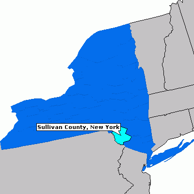
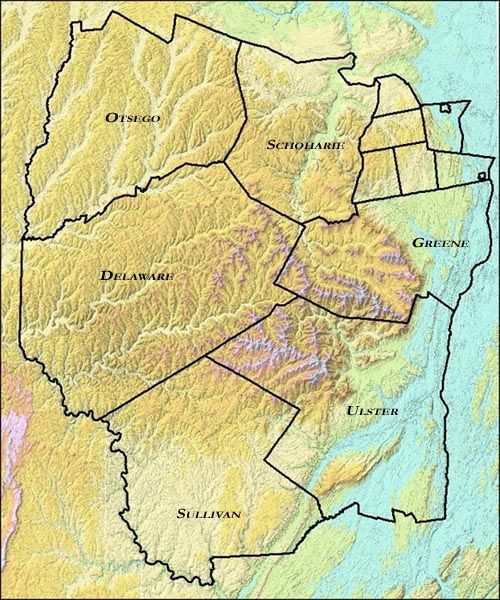
Ultimately and truthfully, not a whole lot changed in the work between drafts and, in fact, one of the most obvious changes is that of the second picture. While the first version of the Catskill Counties was undeniably very accurate, it did not properately work with my writing the way I had hoped and was difficult to relate to because the audience doesn't know the relation of Sullivan County to other counties, they know it in relation to New York's state borders and New York City. By changing the picture to the one currently on the project, I have not only shown where Sullivan County is, but also where it is in relation to the rest of New England. This is more important than it may seem. Though the audience is getting a better idea of where the location being described is, but I am also building ethos appeal through my ability to engage the audience in something they most likely didn't know, so early in the essay. As far as wholesale changes, there weren't many. Many sentences needed sentence fluency revision and some sentences were written with misspellings or fragments.

I learned quite a bit from this project through photo analysis, patience, symbolism and photography as a whole. I had never had much of an affluency for photography, but a project such as this that also hybrids with my analysis strength helps push me through projects that I, "May not like," or "May not think I will like." Ultimately, projects such as this will benefit me in the long run and are another stepping stone on the path through life.

Links

Rough Draft 2
Rough Draft 1
Statement of Purpose

Writing Project 1

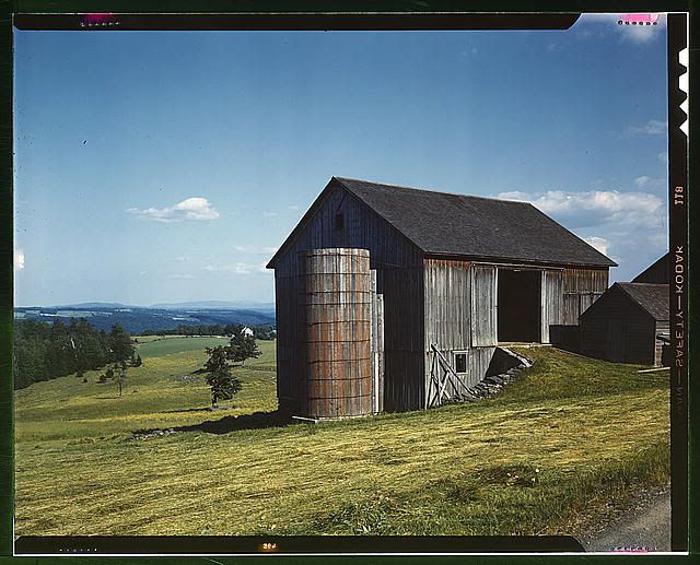
Take a look at a photograph. Any picture has an interesting story beneath its glowing shimmer, worn tatters or as in the case below, digital compilation of pixels. Often an image of a simple object, in a simple setting, with the seemingly simplest background information yield not a simple picture, but a picture lacking solid research. As such case, take this picture of a barn on a hillside:


No matter which aspect of the photo is cropped and analyzed, very little would make much sense without research. Similarly, even if the viewer did try to make something out of it, the ideas would have little backing and can often be manipulated or broken when research is done. Yet even without any background information, a viewer can still come up with determinations about the picture. For instance, the barn appears to be in the countryside. The bright colors and openness are signs of peace and serenity. The barn doesn’t appear to be in its heyday, but yet seems sturdy and able to withstand the weather. Now, through some background information such as the barn’s location in Sullivan County in New York’s Catskill Region, more information can be derived.


The picture was also taken in 1943, during the heat of World War II. Now, with this sort of background many more inferences can be made. One of the easiest could be the peculiarity of the barn being located in a place not famous for its good weather and during one of the greatest conflicts in human history, yet it seems unscathed and in fact, quite peaceful. An audience may be skeptical of the picture’s intentions after knowing this, being that it does seem so serene in such an awful time in history. That brings us around to what would be the purpose of a photographer to take this picture. Sure John Collier may have just stumbled onto a picturesque scene in upstate New York, but on the other hand, there may have been full intentions behind the camera click.

To fully understand the purpose and conflict behind Collier’s photography, it helps to also get a grasp on his background and influence. Collier was born in 1913 and worked for the Farm Securities Administration (FSA) and the Office of War Information between 1941 and 1943. On top of that, Collier married in spring 1943, leaving several reasons for a picture such as this. One of which is the marriage, obviously contributing to a bright context and a content feeling in a time of chaos, like that of the picture. The other reason is a bit tougher.

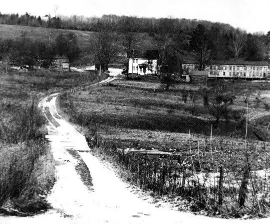
The FSA was aimed at boosting America’s agriculture economy since it had just been through the detriment of the Great Depression and Dust Bowl. The picture of the barn is one of the FSA pictures and obviously is going to be taken as foundation for a “stable farming economy” rather than as purely reality. A gloomy picture of a decrepit farm with dead crops and bad weather would encourage an undesirable outlook on the state of agriculture in the United States. As a comparison, observe this picture taken by Wayne Wirtanen:


This picture was also taken in the early 1940s of a farm. Apart from being located two counties to the West of the first picture’s barn, the picture’s circumstances are quite similar. So why then are the two pictures so different? One was taken as government propaganda by a man whose soul position was to make farming and agriculture seem better than it was. The other is the reality of the time with poor crops and a rundown looking farm. In actuality, even the pristine picture could have been in much worse shape than it comes across as, but the photographer was keen to show its best side and in the best way possible. Here’s another piece of information; the picture was taken during June. Summertime on a farm is the heart of growing season, yet there doesn’t seem to be much for crops on the first picture’s farm. The green grass is likely just from natural rains and seasonal growth, but the farm itself seems to be doing very little in terms of crop production. Equally odd is how there is absolutely no farm equipment in view. The only sign of life at all is the dwindled stack of logs near the ramp into the barn.

Much of these issues are also symbolized through various elements in the picture itself. A key point, going off of the most recent statement, involves the barn’s open doorway. If the research is analyzed to accompany the picture, it is not difficult to see the darker implications within the bright outer shell, much like the barn entrance. The barn has full natural lighting on it that gives it the aura of being bright and uplifting, but should it be looked into, the darkened insides are revealed, much like the barn also has a “dark side.”

Also in regards to symbolism, take a look at the following popular large scale corporation’s logos:


Notice the arrow in the negative space between the “E” and “X” in FedEx and the yellow arrow in the Amazon logo. In FedEx, it emphasizes quickness whereas Amazon’s represents a completeness of service offered (From A to Z) as well as customer satisfaction. Though very few people ever notice these symbols in everyday passing, yet look once more at the picture of the barn taking into special consideration the silo and roof line. Undoubtedly, the end of the barn has an amazing resemblance to an arrow. Being that this picture was taken for propaganda purposes for agriculture economy, it is a logo in a sense. By incorporating an upward facing arrow, Collier is demonstrating the rise in farming as a profession without even having to dictate it. The arrow also acts as a vector of attention raising our gaze upward in the photograph toward the sky. Though the phrase may not have existed yet, the concept surely did; the sky is the limit. What better idea is there to attribute to a propaganda photograph?

In relation to the arrow, notice that both the ground to the left and the roof line to the right slope up wards toward the arrow tip. Besides just accompanying the symbol, they act as a boost to help fulfill the arrow as the focal of the photograph, even though at quick glance the entire barn appears to earn the title. Also, they can be seen as the associated problems with the industry that are falling away now that the Dust Bowl has past and the economy is rising again.
While the picture of a barn on a hill may seem like a simpler place in a simpler time, it is quite necessary to exhaust complete research on such a subject to grasp its complete meaning. Obviously there is in entire other side to the photograph than what meets the eye. It may seem as though, even after all these points, that Collier was simply taking a good looking picture, but when it comes down to a creative photographer being paid for output quality, and especially for the government, there is no limit to the extent of thought that went through his head while taking this picture. Surely after doing extended research and gathering so many background points, the simple barn is merely the theme of the photo rather than the focal point. Without a doubt, the FSA surely used this picture to the fullest extent, and rightfully so. This photograph is everything the administration could hope for in a photo. John Collier did an excellent job with this photograph and it takes much more than a simple glance to comprehend the entirety of his creativity and incorporation of symbolism.


Thursday, October 15, 2009

WP1 Rough Draft 2: A Glance is Only a Start

Take a look at a picture. Any picture has an interesting story beneath its glowing shimmer, worn tatters or as in the case below, digital compilation of pixels. Often an image of a simple object, in a simple setting, with the seemingly simplest background information yield not a simple picture, but a picture lacking solid research. As such case, take this picture of a barn on a hillside:


No matter which aspect of the photo is cropped and analyzed, very little would make much sense without research. Yet even without any background information, a viewer can still come up with determinations about the picture. For instance, the barn appears to be in the countryside. The bright colors and openness are signs of peace and serenity. The barn doesn’t appear to be in its heyday, but yet seems sturdy and able to withstand the weather. Now, through some background information such as the barn’s location in Sullivan County in New York’s Catskill Region, more information can be derived.


The picture was also taken in 1943, during the heat of World War II. Now, with this sort of background many more inferences can be made. One of the easiest could be the peculiarity of the barn being located in a place not famous for its good weather and during one of the greatest conflicts in human history, yet it seems unscathed and in fact, quite peaceful. An audience may be skeptical of the picture’s intentions after knowing this, being that it does seem so serene in such an awful time in history. That brings us around to what would be the purpose of a photographer to take this picture. Sure John Collier may have just stumbled onto a picturesque scene in upstate New York, but on the other hand, there may have been full intentions behind the camera click.

To fully understand the purpose and conflict behind Collier’s photography, it helps to also get a grasp on his background and influence. Collier was born in 1913 and worked for the Farm Securities Administration (FSA) and the Office of War Information between 1941 and 1943. On top of that, Collier married in spring 1943, leaving several reasons for a picture such as this. One of which is the marriage, obviously contributing to a bright context and a content feeling in a time of chaos, like that of the picture. The other reason is a bit tougher.

The FSA was aimed at boosting America’s agriculture economy since it had just been through the detriment of the Great Depression and Dust Bowl. The picture of the barn is one of the FSA pictures and obviously is going to be taken as foundation for a “stable farming economy” rather than as purely reality. A gloomy picture of a decrepit farm with dead crops and bad weather would encourage an undesirable outlook on the state of agriculture in the United States. As a comparison, observe this picture taken by Wayne Wirtanen:


This picture was also taken in the early 1940s of a farm. Apart from being located two counties to the West of the first picture’s barn, the picture’s circumstances are quite similar. So why then are the two pictures so different? One was taken as government propaganda by a man whose soul position was to make farming and agriculture seem better than it was. The other is the reality of the time with poor crops and a rundown looking farm. In actuality, even the pristine picture could have been in much worse shape than it comes across as, but the photographer was keen to show its best side and in the best way possible. Here’s another piece of information; the picture was taken during June. Summertime on a farm is the heart of growing season, yet there doesn’t seem to be much for crops on the first picture’s farm. The green grass is likely just from natural rains and seasonal growth, but the farm itself seems to be doing very little in terms of crop production. Equally odd is how there is absolutely no farm equipment in view. The only sign of life at all is the dwindled stack of logs near the ramp into the barn.

Much of these issues are also symbolized through various elements in the picture itself. A key point, going off of the most recent statement, involves the barn’s open doorway. If the research is analyzed to accompany the picture, it is not difficult to see the darker implications within the bright outer shell, much like the barn entrance. The barn has full natural lighting on it that gives it the aura of being bright and uplifting, but should it be looked into, the darkened insides are revealed, much like the barn also has a “dark side.”

Also in regards to symbolism, take a look at the following popular large scale corporation’s logos:


Notice the arrow in the negative space between the “E” and “X” in FedEx and the yellow arrow in the Amazon logo. In FedEx, it emphasizes quickness whereas Amazon’s represents a completeness of service offered (From A to Z) as well as customer satisfaction. Though very few people ever notice these symbols in everyday passing, yet look once more at the picture of the barn taking into special consideration the silo and roof line. Undoubtedly, the end of the barn has an amazing resemblance to an arrow. Being that this picture was taken for propaganda purposes for agriculture economy, it is a logo in a sense. By incorporating an upward facing arrow, Collier is demonstrating the rise in farming as a profession without even having to dictate it. The arrow also acts as a vector of attention raising our gaze upward in the photograph toward the sky. Though the phrase may not have existed yet, the concept surely did; the sky is the limit. What better idea is there to attribute to a propaganda photograph?

In relation to the arrow, notice that both the ground to the left and the roof line to the right slope up wards toward the arrow tip. Besides just accompanying the symbol, they act as a boost to help fulfill the arrow as the focal of the photograph, even though at quick glance the entire barn appears to earn the title. Also, they can be seen as the associated problems with the industry that are falling away now that the Dust Bowl has past and the economy is rising again.
While the picture of a barn on a hill may seem like a simpler place in a simpler time, it is quite necessary to exhaust complete research on such a subject to grasp its complete meaning. Obviously there is in entire other side to the photograph than what meets the eye. It may seem as though, even after all these points, that Collier was simply taking a good looking picture, but when it comes down to a creative photographer being paid for output quality, and especially for the government, there is no limit to the extent of thought that went through his head while taking this picture. Surely after doing extended research and gathering so many background points, the simple barn is merely the theme of the photo rather than the focal point. Without a doubt, the FSA surely used this picture to the fullest extent, and rightfully so. This photograph is everything the administration could hope for in a photo. John Collier did an excellent job with this photograph and it takes much more than a simple glance to comprehend the entirety of his creativity and incorporation of symbolism.

Tuesday, October 13, 2009

WP1 Rough Draft 1: A Glance is Only a Start

Take a look at a picture. Any picture has an interesting story beneath its glowing shimmer, worn tatters or as in the case below, digital compilation of pixels. Take this picture of a barn on a hillside:


Without any background information, a viewer can still come up with determinations about the picture. For instance, the barn appears to be in the countryside. The bright colors and openness are signs of peace and serenity. The barn doesn’t appear to be in its heyday, but yet seems sturdy and able to withstand the weather. Now, through some background information such as the barn’s location in Sullivan County in New York’s Catskill Region, more information can be derived.


The picture was also taken in 1943, during the heat of World War II. Now, with this sort of background many more inferences can be made. One of the easiest could be the peculiarity of the barn being located in a place not famous for its good weather and during one of the greatest conflicts in human history, yet it seems unscathed and in fact, quite peaceful. An audience may be skeptical of the picture’s intentions after knowing this, being that it does seem so serene in such an awful time in history. That brings us around to what would be the purpose of a photographer to take this picture. Sure John Collier may have just stumbled onto a picturesque scene in upstate New York, but on the other hand, there may have been full intentions behind the camera click.

To fully understand the purpose and conflict behind Collier’s photography, it helps to also get a grasp on his background and influence. Collier was born in 1913 and worked for the Farm Securities Administration (FSA) and the Office of War Information between 1941 and 1943. On top of that, Collier married in spring 1943, leaving several reasons for a picture such as this. One of which is the marriage, obviously contributing to a bright context and a content feeling in a time of chaos, like that of the picture. The other reason is a bit tougher.

The FSA was aimed at boosting America’s agriculture economy since it had just been through the detriment of the Great Depression and Dust Bowl. The picture of the barn is one of the FSA pictures and obviously is going to be taken as foundation for a “stable farming economy” rather than as purely reality. A gloomy picture of a decrepit farm with dead crops and bad weather would encourage an undesirable outlook on the state of agriculture in the United States. As a comparison, observe this picture taken by Wayne Wirtanen:


This picture was also taken in the early 1940s of a farm. Apart from being located two counties to the West of the first picture’s barn, the picture’s circumstances are quite similar. So why then are the two pictures so different? One was taken as government propaganda. The other was reality. In actuality, even the pristine picture could have been in much worse shape than it comes across as, but the photographer was keen to show its best side and in the best way possible. Here’s another piece of information; the picture was taken during June. Summertime on a farm is the heart of growing season, yet there doesn’t seem to be much for crops on the first picture’s farm. The green grass is likely just from natural rains and seasonal growth, but the farm itself seems to be doing very little crop production. Equally odd is how there is absolutely no farm equipment in view. The only sign of life at all is the dwindled stack of logs near the ramp into the barn.

Much of these issues are also symbolized through various elements in the picture itself. A key point, going off of the most recent statement, involves the barn’s open doorway. If the research is done to accompany the picture, it is not difficult to see the darker implications within the bright outer shell, much like the barn entrance. The barn has full natural lighting on it that gives it the aura of being bright and uplifting, but should it be looked into, the darkened insides are revealed, much like the barn also has a “dark side.”

Also in regards to symbolism, take a look at the following popular large scale corporation’s logos:

Notice the arrow in the negative space between the “E” and “X” in FedEx and the yellow arrow in the Amazon logo. In FedEx, it emphasizes quickness whereas Amazon’s represents a completeness of service offered (From A to Z) as well as customer satisfaction. Though very few people ever notice these symbols in everyday passing, yet look once more at the picture of the barn taking into special consideration the silo and roof line. Undoubtedly, the end of the barn has an amazing resemblance to an arrow. Being that this picture was taken for propaganda purposes for agriculture economy, it is a logo in a sense. By incorporating an upward facing arrow, Collier is demonstrating the rise in farming as a profession without even having to dictate it. The arrow also acts as a vector of attention raising our gaze upward in the photograph toward the sky. Though the phrase may not have existed yet, the concept surely did; the sky is the limit. What better idea is there to attribute to a propaganda photograph?

In relation to the arrow, notice that both the ground to the left and the roof line to the right slope up wards toward the arrow tip. Besides just accompanying the symbol, they act as a boost to help fulfill the arrow as the focal of the photograph, even though at quick glance the entire barn appears to earn the title. Also, they can be seen as the associated problems with the industry that are falling away now that the Dust Bowl has past and the economy is rising again.
While the picture of a barn on a hill may seem like a simpler place in a simpler time, it is quite necessary to exhaust complete research on such a subject to grasp its complete meaning. Obviously there is in entire other side to the photograph than what meets the eye. It may seem as though, even after all these points, that Collier was simply taking a good looking picture, but when it comes down to a creative photographer being paid for output quality, and especially for the government, there is no limit to the extent of thought that went through his head while taking this picture. Surely after doing extended research and gathering so many background points, the simple barn is merely the theme of the photo rather than the focal point. Without a doubt, the FSA surely used this picture to the fullest extent, and rightfully so. This photograph is everything the administration could hope for in a photo. John Collier did an excellent job with this photograph and it takes much more than a simple glance to comprehend the entirety of his creativity and incorporation of symbolism.

Friday, October 2, 2009

WP1 Statement of Purpose: A Simpler Place, Not a Simpler Time

Go here, go there. Do this, do that. Watch out, hurry up. Computers, networking, future, investments, economics, goals and dreams. We live in, undoubtedly, an extremely difficult world to grasp, understand and excel within. So many things rush past us without a second to take a gander. Globally significant events can occur and be the talk of everyone's dinner table conversation one night, but forgotten completely a week later. The phrase is heard often of a "simpler place and a simpler time. Yet as simple as it may seem to us, it is quite possible the times were just as harried, just on a smaller scale.

Who would argue with a person proclaiming World War II to be an incredible worldwide event? Obviously with its complete historical significance and brutality, World War II will stand for centuries as one of the greatest wars in mankind’s history. The war spread over several continents and millions of people were killed, so it’s safe to say the war had an impact and likely changed every human’s life at the time and since. Strangely enough, there were still places in the world where, even in some of the worst days of the war, pictures like the one below could be taken that show none of the mass murdering, brutality, killing or even hardship.


In fact, photos like this can purely describe a “simpler place, in a not so simple time.” Surely folks that lived in this rural area in upper New York were concerned for the welfare of their country as much as anyone else, though they may not have felt any imminent danger in the midst of their country lifestyle. There are many questions left unanswered as well. The owners of this farm may have had a child that was debating whether to enlist in the military or work in the family business. The father and his family may be trying to figure out how to survive on their rationed meals. Yet as terrible as all of this sounds, there may have been no issues at all. The family may be too far away from any civilization and hardly be able to follow the war except for weekly or monthly trips into town.

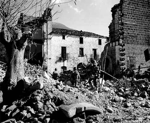
It would have been easy to say a picture like the one below was taken in the midst of great turmoil and catastrophic events.


With soldiers marching through the ruble-strewn streets of Italy wondering whether or not they’ll ever see their family, belongs or another game at Yankee Stadium ever again, surely it can be agreed their lives were much more distressed than that of the farmer. At the same time, does that in turn mean that the farmer’s life is not complicated? Most definitely, the comparison is a matter of perception. The farmer himself may say he has an easy life, and the soldier may imply he is simply doing his job, but in truth, American civilians often had quite the set of complexities thrown at them during the late 1930s and early ‘40s. Granted on a smaller and more intrinsic scale, the civilians faced food rations, lack of convenience they enjoyed before the war, increased pressure from the government in both propaganda and factory work to sustain a military, and in the case of the farmer, maybe not being able to cater to everything he needs for his farm because the materials may be being used for other things to benefit the war effort.

Finally, by understanding the farmer’s predicament as more than a similar type we see today, we can understand that the barn in the first picture may be seeing beautiful, serene landscape, but by standing during this time period, the best description is most definitely “a simpler place in a not so simple time.”